|
|
| (5 intermediate revisions by 2 users not shown) |
| Line 61: |
Line 61: |
| === Info Block === | | === Info Block === |
| Coming soon... | | Coming soon... |
|
| |
| == Input Controls ==
| |
|
| |
| ==== Helper Text ====
| |
| Helper text conveys additional guidance about the input control, such as how it will be used. Helper text will only take up a single line below the input control and will be persistently visible.
| |
|
| |
| To add Helper text to input control, create '''<ViewModelColumn>_HelperText''' column in the ViewModel editor, where <ViewModelColumn> is the name of the column with input.
| |
| [[File:Input control with helper text.png|none|thumb|420x420px|Input control with helper text]]
| |
|
| |
| ==== Placeholder ====
| |
| Placeholder text appears in the input control when it has no value set. Placeholder can be a tip for users on how to fill up this input control.
| |
|
| |
| To add Placeholder to input control, create '''<ViewModelColumn>_Placeholder''' column in the ViewModel editor, where <ViewModelColumn> is the name of the column with input.
| |
| [[File:Input control with placeholder.png|none|thumb|422x422px|Input control with placeholder]]
| |
| Input controls are rendered differently depending on the value type.
| |
|
| |
| Please check out [[Databound Placeholder text]] for more information.
| |
|
| |
| ==== Text Types ====
| |
| For inputs intended as type text, this type can be overridden with something else. Use the tagged value texttype on the column in the ViewModel.
| |
| * Password
| |
| * Email
| |
| * Tel
| |
| * URL
| |
| * Search
| |
| The type of browser used determines how these input types are rendered.
| |
|
| |
| For further reference, look at https://developer.mozilla.org/en-US/docs/Web/HTML/Element/input/password
| |
|
| |
| ==== Inputs with Icon ====
| |
| You can add an icon to the input control to improve the visual presentation or give users the visual indicator of which type of input control it is.
| |
|
| |
| To add an icon to the input control, set TaggedValue "Icon" on ViewModelColumn. The value of TaggedValue should be the icon name (MDriven Turnkey uses Material Icons – you can find these icon names on the [https://fonts.google.com/icons Google fonts website]).
| |
|
| |
| It is possible to choose an icon position in the input control. By default, the icon will be placed at the start of the input control (leading icon). You can change this position by setting TaggedValue "IconPosition" to "after'.
| |
| [[File:Input control with leading icon.png|none|thumb|460x460px|Input control with leading icon]]
| |
| [[File:Input control with trailing icon.png|none|thumb|459x459px|Input control with trailing icon]]
| |
| [[File:Input control with leading icon and placeholder.png|none|thumb|460x460px|Input control with leading icon and placeholder]]
| |
|
| |
| == Buttons ==
| |
|
| |
| === Data-bind Action's Presentation Name ===
| |
| Add '''<ActionColumn>_Presentation''' column in ViewModel to be able to dynamically change a presentation text of action.
| |
|
| |
| === Default Buttons ===
| |
| {| class="wikitable"
| |
| !Example
| |
| !Modifier-class
| |
| |-
| |
| |[[File:Button default.png|frameless]]
| |
| |
| |
| |-
| |
| |[[File:Button danger.png|frameless]]
| |
| |'''danger'''
| |
| |-
| |
| |[[File:Button warning.png|frameless]]
| |
| |'''warning'''
| |
| |-
| |
| |[[File:Button success.png|frameless]]
| |
| |'''success'''
| |
| |-
| |
| |[[File:Button info.png|frameless]]
| |
| |'''info'''
| |
| |}
| |
|
| |
| === Outlined Buttons ===
| |
| {| class="wikitable"
| |
| !Example
| |
| !Modifier-class
| |
| |-
| |
| |[[File:Outlined button default.png|frameless]]
| |
| |'''outlined'''
| |
| |-
| |
| |[[File:Outlined button danger.png|frameless]]
| |
| |'''outlined danger'''
| |
| |-
| |
| |[[File:Outlined button warning.png|frameless]]
| |
| |'''outlined warning'''
| |
| |-
| |
| |[[File:Outlined button success.png|frameless]]
| |
| |'''outlined success'''
| |
| |-
| |
| |[[File:Outlined button info.png|frameless]]
| |
| |'''outlined info'''
| |
| |}
| |
|
| |
| === Text Buttons ===
| |
| {| class="wikitable"
| |
| !Example
| |
| !Modifier-class
| |
| |-
| |
| |[[File:Text button default.png|frameless]]
| |
| |'''flat'''
| |
| |-
| |
| |[[File:Text button danger.png|frameless]]
| |
| |'''flat danger'''
| |
| |-
| |
| |[[File:Text button warning.png|frameless]]
| |
| |'''flat warning'''
| |
| |-
| |
| |[[File:Text button success.png|frameless]]
| |
| |'''flat success'''
| |
| |-
| |
| |[[File:Text button info.png|frameless]]
| |
| |'''flat info'''
| |
| |}
| |
|
| |
| === Shaped Buttons ===
| |
| {| class="wikitable"
| |
| !Example
| |
| !Modifier-class
| |
| |-
| |
| |[[File:Shaped button default.png|frameless]]
| |
| |'''shaped'''
| |
| |-
| |
| |[[File:Shaped button danger.png|frameless]]
| |
| |'''shaped danger'''
| |
| |-
| |
| |[[File:Shaped button warning.png|frameless]]
| |
| |'''shaped warning'''
| |
| |-
| |
| |[[File:Shaped button success.png|frameless]]
| |
| |'''shaped success'''
| |
| |-
| |
| |[[File:Shaped button info.png|frameless]]
| |
| |'''shaped info'''
| |
| |}
| |
|
| |
| === Buttons With Icons ===
| |
| You can add an icon to your button. To do that, add the Tagged Value "'''Icon'''" to your ViewModelColumn which contains action. The value of the Tagged Value should be the icon name. We use Material Design icons as the default icons for the MDriven Turnkey application. Find the different icons on the following website: '''[https://fonts.google.com/icons Icons - Material Design]'''.
| |
|
| |
| Go to [https://fonts.google.com/icons Icons – Material Design] and choose the icon you want to add to your button.
| |
| [[File:Material Icons.png|alt=Choose an icon on the Material Design Icons website|none|thumb|561x561px|Choose an icon on the Material Design Icons website]]
| |
| After you've chosen the icon you want to add to your button, click on the left bottom corner to expand the icon description. There you will be able to copy the name of the icon to the value of Tagged Value.
| |
| [[File:Copy icon name.png|none|thumb|561x561px|Copy the icon name to the value of TaggedValue "'''Icon'''"]]NOTE: If the name is "Arrow back", you must probably use "arrow_back" - the MaterialDesign icon web page is not very clear on what name to use but the space is replaced with an underscore and no capitals in the names![[File:TaggedValue for Icon.png|none|thumb|564x564px|Add the name of the chosen icon to the TaggedValue value.]]
| |
| Also, you can choose the position of the icon with the help of TaggedValue – "'''IconPosition'''". (''There are two available options: before or after. By default – before).''
| |
|
| |
| {| class="wikitable"
| |
| !Example
| |
| !Description
| |
| |-
| |
| |[[File:Leading icon button.png|frameless]]
| |
| |Default presentation of a button with a leading icon
| |
| |-
| |
| |[[File:Icon after button.png|frameless]]
| |
| |Presentation of a button with an icon after the button text
| |
| |-
| |
| |[[File:Icon button.png|frameless]]
| |
| |Icon button without button text
| |
| |-
| |
| |[[File:Fab icon button.png|frameless]]
| |
| |Icon button with addition of modifier-class "'''fab'''"
| |
| |}
| |
|
| |
|
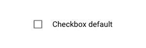
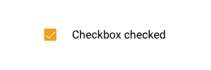
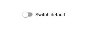
| == Checkbox and Switch == | | == Checkbox and Switch == |
| Line 237: |
Line 84: |
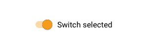
| |[[File:Switch selected.png|frameless]] | | |[[File:Switch selected.png|frameless]] |
| |Switch selected presentation | | |Switch selected presentation |
| |}
| |
|
| |
| == Groupbox ==
| |
| You can style the groupbox on your page as a material design card. Add the modifier-class "'''card'''" in <u>Style ref</u> to the ViewModelColumn with groupbox.
| |
| {| class="wikitable"
| |
| !Example
| |
| !Modifier-class
| |
| !Description
| |
| !Tagged value
| |
| |-
| |
| |[[File:Group-card.png|frameless]]
| |
| |'''card'''
| |
| |Groupbox styled as material design card.
| |
| | -
| |
| |-
| |
| |[[File:Groupbox card without header.png|frameless|292x292px]]
| |
| |<nowiki>-</nowiki>
| |
| |Groupbox without header styled as material design card.
| |
| |HideHeading = True
| |
| |} | | |} |
|
| |
|
| Line 282: |
Line 110: |
| |'''h6''' | | |'''h6''' |
| |} | | |} |
| | See also: [[Layout and CSS]] |
|
| |
|
| == DataIsLink == | | == Date Picker == |
| In the MDriven Turnkey, you can represent your data string as a hyperlink. To make it, you should set [[MDrivenDesignerTaggedValueHints|TaggedValue]] "'''DataIsLink'''" on your ViewModelColumn with the data you want to present in the Turnkey as a hyperlink. The text of the link will be the ViewModelColumn's name.
| | {{Edited|July|12|2024}} |
| | |
| If you want to change the text of the hyperlink or set it dynamically, you need to add another ViewModelColumn into your ViewModel and name it as '''<NameOfColumnWithHyperlink>_LinkText'''.
| |
|
| |
|
| == Date Picker ==
| | [[Category:TOC]] |

