No edit summary |
No edit summary |
||
| Line 19: | Line 19: | ||
== Layout == | == Layout == | ||
MDriven Turnkey uses the CSS Grid to create the application layout - unless you make use of [[PlacingContainer|placingcontainers]] | MDriven Turnkey uses the CSS Grid to create the application layout - unless you make use of [[PlacingContainer|placingcontainers]]. Then the CSS flexbox is the core layout creator. | ||
== What are Modifier-classes? == | == What are Modifier-classes? == | ||
Modifier-classes allow you to | Modifier-classes allow you to customize MDriven Turnkey's components. | ||
To use modifier-classes, put them into the "'''Style ref'''" field in the ViewModel Editor. | To use modifier-classes, put them into the "'''Style ref'''" field in the ViewModel Editor. | ||
[[File:StyleRef field in ViewModel editor.png|none|thumb| | [[File:StyleRef field in ViewModel editor.png|none|thumb|841x841px|'''Style ref''' in ViewModel editor]] | ||
== Text Elements == | == Text Elements == | ||
=== Context | === Context Colours === | ||
From the box, you're able to use five default contextual colours in MDriven Turnkey. You can modify them with the help of CSS custom properties. | From the box, you're able to use five default contextual colours in MDriven Turnkey. You can modify them with the help of CSS custom properties. | ||
* Danger | * Danger | ||
| Line 62: | Line 62: | ||
== Checkbox and Switch == | == Checkbox and Switch == | ||
'''Checkbox''' is the default presentation of the | '''Checkbox''' is the default presentation of the Boolean attribute in your model. | ||
{| class="wikitable" | {| class="wikitable" | ||
!Example | !Example | ||
| Line 73: | Line 73: | ||
|Checkbox checked presentation | |Checkbox checked presentation | ||
|} | |} | ||
'''Switch''' is a different way in which you can present your | '''Switch''' is a different way in which you can present your Boolean attribute in MDriven Turnkey. To change the presentation of the Boolean attribute from the default '''checkbox''' to '''switch,''' set the '''TaggedValue "Switch"''' to your ViewModelColumn. | ||
{| class="wikitable" | {| class="wikitable" | ||
!Example | !Example | ||
| Line 109: | Line 109: | ||
|'''h6''' | |'''h6''' | ||
|} | |} | ||
See also: [[Layout and CSS]] | '''See also:''' [[Layout and CSS]] | ||
== Date Picker == | == Date Picker == | ||
{{Edited|July|12|2024}} | Coming soon...{{Edited|July|12|2024}} | ||
[[Category:TOC]] | [[Category:TOC]] | ||
Revision as of 05:47, 9 December 2024
Getting Started
The MDriven Turnkey Style system is based on the BEM methodology. BEM stands for Block, Element, Modifier and is a convention on how to structure CSS rules. Read more here.
Out of the box, you will receive the following UI elements:
- Static text
- Image
- Text field
- Checkbox
- Select (Combobox)
- Date picker
- Data-table
- Button
- File upload
- Link
- Textarea
- Number field
- Float field
Layout
MDriven Turnkey uses the CSS Grid to create the application layout - unless you make use of placingcontainers. Then the CSS flexbox is the core layout creator.
What are Modifier-classes?
Modifier-classes allow you to customize MDriven Turnkey's components.
To use modifier-classes, put them into the "Style ref" field in the ViewModel Editor.
Text Elements
Context Colours
From the box, you're able to use five default contextual colours in MDriven Turnkey. You can modify them with the help of CSS custom properties.
- Danger
- Warning
- Success
- Info
Chip
With the help of the modifier-classes, you can style your static text as a chip component from Google Material design.
| Example | Modifier-class |
|---|---|

|
chip |

|
chip danger |

|
chip warning |

|
chip success |

|
chip info |
Info Block
Coming soon...
Checkbox and Switch
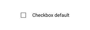
Checkbox is the default presentation of the Boolean attribute in your model.
| Example | Description |
|---|---|
|
Default checkbox presentation |

|
Checkbox checked presentation |
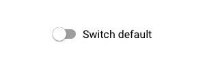
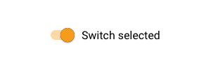
Switch is a different way in which you can present your Boolean attribute in MDriven Turnkey. To change the presentation of the Boolean attribute from the default checkbox to switch, set the TaggedValue "Switch" to your ViewModelColumn.
| Example | Description |
|---|---|
|
Default switch presentation |
|
Switch selected presentation |
Typography
With the help of the modifier-classes, you can style the text data in your Turnkey application as headings. The available modifier-classes are listed in the table below.
| Example | Modifier-class |
|---|---|

|
h1 |

|
h2 |

|
h3 |

|
h4 |

|
h5 |

|
h6 |
See also: Layout and CSS
Date Picker
Coming soon...

