- MDriven Architecture
- Build Enterprise Information Systems
- Complexity shows up almost immediately–get the tools to manage it
- Different types of bugs
- Enterprise architect information
- Fashion Gist and Modernity
- GistMDriven
- Main concepts definition
- MDriven Turnkey Architecture
- Model Driven
- Philosophy–where lies the value
- Reality and the theoretical best model
- Database OR Mapping
- User interface technologies
- Barcode - on Android - with Xamarin and MDriven
- Catching more information in your model
- Creating CustomControl that Shows Data in a Gantt Chart
- Custom controls in ViewModel aided Views
- Delayed Fetch
- Derivation expressions
- Derived settable attributes
- Diagrams in Diagrams
- Ecomdl
- Enumerations
- Enumerations in Modlr
- Exception starting
- GuardConstraints
- Making sense of legacy data–DB Reverse
- Material Design Icons
- MDriven Designer and Modlr extensions–exporting data
- MDriven Designer–a new Rename function to save you time
- MDriven In Xamarin
- MDrivenDesignerPropertyInspectorHints
- NugetProject
- Object Identity
- PersistenceMapperWEBAPIClient
- Plugins in Modlr
- PopUp action
- PreserveLegacyFilenames
- Property inspector
- Simulate login
- Styling WPF Applications and ViewModels
- Text formatting
- UI First–or information first
- UIOverride
- Updates to AutoForm and Debugger after latest feedback
- Using other than standard Persistence Mappers per attribute
- Using WECPOF in runtime
- WECPOF
- WECPOF Goodies
- WPF Debugger
- Xmi
- Angular Ext Component
- autocomplete
- autofocus
- BlobDownloadLink
- ClientSortable
- DataIsHtml
- DataIsImageUrl
- DataIsLink
- BlobType
- FixColSize
- FormatAttr
- HideHeading
- MaxFetch
- MaxFileSizeInBytes
- Placeholder
- Resizable
- SeekerSortable
- SkipStyleLogic
- StringFormat
- StringFormatAngular
- StringFormatRazor
- Switch
- Autofocus
- BlobDownloadLink
- Texttype
- MaxFetch
- A few words on linq
- Acting on object changes
- Case sensitive or not
- Char to int and back
- ClassFromString
- Collection of strings
- Comparing strings
- Convert string to bytes
- Creating numeric types
- Custom types and custom operations in OCL
- Deepclone
- Default String Representation and asString
- Encoding
- Escape codes
- Examples on collection operators
- Methods
- Number conversions
- Ocl hex to dec
- Regular expressions
- Set vs bag
- Split
- Split time string to value
- State value as a string
- Understanding OCL with reference to SQL
- Unique constraints on 1 to 1 links
- VerbalizePatterns
- addReturnIndexOf0
- add
- and
- append
- asBag
- asCommaList
- asSeparatedList
- asSequence
- asSet
- at
- at0
- Bag
- clear
- collect
- dictionary
- difference
- excluding
- exists
- filterOnType
- first
- forAll
- foreach
- groupBy
- last
- includes
- includesAll
- including
- indexOf
- indexOf0
- insertAt
- intersection
- isEmpty
- notEmpty
- orderBy
- orderDescending
- prepend
- removeAt
- reject
- select
- sequence
- set
- size
- subSequence
- sum
- symmetricDifference
- union
- allInstances
- allInstancesAtTime
- allLoadedObjects
- allStates
- allSubClasses
- allSuperTypes
- associationEnds
- associationEndsWithType
- asString
- AsTaJson
- atTime
- attributes
- brokenConstraints
- canAccess
- constraints
- count
- emptyList
- existing
- externalId
- format
- let
- maxValue
- minValue
- nullValue
- objectfromExternalId
- oclAsType
- oclGetStates
- oclIsKindOf
- oclIsTypeOf
- random
- safeCast
- SoapCall
- superTypes
- taggedValue
- taggedValueOnFeature
- Translate
- typename
- CodeDress
- External login services in MDriven Turnkey
- Fonts
- Getting safe–limited–meta information from a Turnkey app
- Logging OCL in Turnkey
- Load balancing Turnkey and MDrivenServer
- MDriven on Synology
- Migrating From MDriven .NET Framework to .NET Core
- Remote Turnkey access
- StartupViewTemplate
- WPFMahappAndGantt
- AppWideAngularScriptIncludes
- AssetsTK
- Calling your own c - sharp .net things from Turnkey–server side
- Connecting javascript SinglePageApplications to Turnkey (SPA)
- DisplayWithVariables
- Geolocation
- Google Analytics in Turnkey app
- Google tag manager
- How to access your Turnkey site with FTP
- Javascript calling Turnkey rest
- Layout and CSS
- LiveUpdate
- MDriven turnkey Face - theme - styles - fashion
- MDriven Turnkey Series
- MDriven Turnkey theming
- Microsoft Azure
- Openid AzureAD
- OpenIdConnect access token and refresh token
- Overriding AngularJS MDriven Turnkey Views
- Pricing
- QR and barcode
- QR-Code to drive a workflow in any MDriven turnkey app
- Receive post data not known at design time
- Render data as html
- Render MVC ViewModel without turnkey
- Rendering the MDriven Turnkey application yourself
- Samples
- Scaling out Turnkey on Azure
- Serverside Turnkey and MVC functioning
- SiteAssets
- Size in Images in Turnkey
- Streaming Client
- SVG
- SysSingleton.MiscSetting
- SysSingleton optional properties
- Theme and style
- Theme as data
- Time zones and sanity–post for future reference
- TinyMCE editor
- Tkusercss
- Turnkey App Current state: Paused
- Turnkey Client Timeout
- Turnkey debug
- Turnkey email settings
- Turnkey extra meta tags
- Turnkey local development tips
- Turnkey MVC Controllers
- Turnkey reload automatically on script change or style change
- Turnkey sample Board Map Balls Gantt
- Turnkey sample Empty start model
- Turnkey sample ProjectPlanner
- Turnkey sample ProjectPlanning
- Turnkey Styling
- TurnkeySettings
- TurnkeyUserLogin
- Use c-sharp code to post to TurnkeyRest
- VClientScreenWidth
- View/Page override
- ViewMeta
- Change password MDriven Server
- Corrupt MDriven Server
- Lost password or locked out
- MDriven Server problem with evolve
- MDrivenServer, opening the built-in database
- No suitable constructor found
- SQL not trusted
- The anti-forgery token could not be decrypted
- Troubleshooting Turnkey deployment
- Duplicate IDs in the database
- CodeFoundButOutOfSync
- AppPool user
- AsyncTicket
- Automating deployment of Turnkey and MDrivenServer on IIS
- CacheInvalidation
- Communication between MDrivenServers
- Deploy Turnkey on your own Azure with OneDrive
- Emailing from an app using MDrivenServer
- Eventlog
- Fill in the email settings in the admin UI
- HardServerUrl
- Injecting the Core server command line parameters via file
- Installation of MDriven Server on Windows 7 Enterprise
- LocalhostDevCert
- LocalServers
- MDriven administrative database tables
- MDrivenServer log
- MDrivenServer Slack web hook
- MDrivenServer with Windows authentication
- MDrivenServerOverride
- MultiTenantPrefix
- Purpose of History Server
- RecyclableMemoryStream
- Server Wide Variables
- Serverinfo
- Serverside actions
- Setting up a History slave
- Slave and History Server
- Slave server in action
- SysAsync package
- SysSingleton.Deflate
- SysSingleton.UrlEncode
- SysSingleton GetSystemUrl
- Turnkey and MDrivenServer logs
- Use SqlServer
- VistaDB
- WSL Windows subsystem for Linux
- Accessing objects and navigating meta-levels in code
- Api documentation
- Code generation
- Codegen Issues .net standard
- Constructor in generated code
- Debug CodeDress
- DisplayQueue
- Evolve db with code
- Side effects
- Unity 3D and MDriven
- Using different WCF Bindings with Enterprise Core Objects – ECO – MDriven framework
- HasUserCode in Enterprise Core Objects
- WinForms MDrivenFramework
- Working with legacy Handles
- Change tracking help SQL
- How your classes are stored in the SQL database when using MDriven
- Microsoft.data
- MySQL–notes to support the use of MySQL with MDriven
- Other PMappers
- Possible file version mismatch detected between ADO.NET Provider and native binaries of SQL Server Compact
- SQL Database
- SQL Server
- SQL Server change tracking
- SQLImport multiple tables with associations
- SQLite
- Versioned on class
- Authenticate with a jwt
- BankId
- Certificate
- External login screen problem
- Fault-finding certificate problems in IIS
- GDPRPolicy
- HashPassword
- HeaderBasedAuthenticationTag
- Hide External Login
- Hide Password login
- High or low exposure to risk
- How does OpenIdConnect work
- Lets encrypt
- OpenID config
- Sign client rest request with certificate
- AccessExpression
- Analyze ViewModel classes and expressions
- Breaking changes
- Comboboxes with strings
- Convergence
- Cursored or Full Tree
- Databind labels in ViewModels
- Databound Placeholder text
- Declarative ViewModels and Taborder
- Explaining “The ViewModel does not require a root object” warning
- How Null is represented in your picklist
- How to use vCurrent and “self” correctly in viewmodels
- Import xml and JSon with MDriven
- Index page
- Input Controls
- JsonToObject vs Tajson
- Multiple file upload component
- Opt out a constraint in all relevant viewmodel
- Per viewmodel ReadOnly mode
- QueryPlan
- RestAllowed UIAllowed
- SelfVM
- SOAP
- SOAP the protocol from the stone age
- Tables and Grids
- The combobox
- The VMClassId Explained
- Timedout viewmodel
- VCurrent and vSelected
- ViewModel access and security
- ViewModel for Business
Contents
Background
The PlacingContainer is a way to organize a view based on the box-in-box principle, in contrast to the default way of placing components on a ViewModel in a Grid pattern with X and Y coordinates.
The web browser FlexBox has been used to explain most of how PlacingContainers work.
What is FlexBox and How is it applied in MDriven?
FlexBox, also known as CSS Flexible Box Layout, is a layout module for web design that allows developers to easily and efficiently arrange and distribute elements within a container. It provides a flexible way to lay out, align and distribute space among items in a container, even when their size is unknown and/or dynamic.
FlexBox works by setting a container to display as a flex container using the display property. The child elements of the container become flex items that can be positioned and sized using various flex properties. The key advantage of using FlexBox is that it allows for responsive layouts that can adapt to different screen sizes and device types, without the need for complex CSS rules or media queries.
When using the web renderer (for example, in TurnKey), the output from the Framework will be HTML with FlexBox CSS for layout. In the Designer or WPF application, you're using MDriven's implementation of a FlexBox renderer.
PlacingContainers are introduced in this blog article: https://blog.mdriven.net/placingcontainers-flexbox/
Notes For When You're Confused By What You're Seeing When Working With Placing Containers (FlexBox)
Why isn't this container filling (becoming the same width) as the container above?
If you haven't made any special settings, it's probably because a container only "fills" the container above in a perpendicular direction. If you want it to fill the whole width, for example, for a table, make its direction "Column".
- Direction Column => Fills horizontally and stacks vertically
- Direction Row => Fills vertically and stacks horizontally
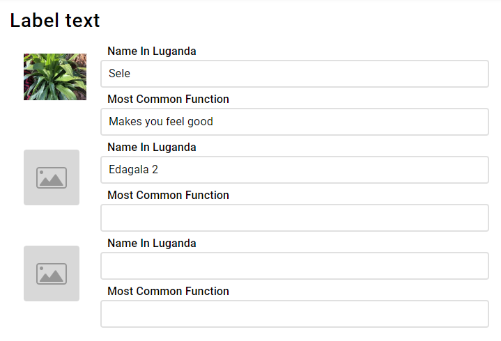
I want to make a table with one fixed-width column and the rest with a flexible width
In the table, the goal is to have the images in a fixed size, and the right takes up the rest of the page width. It is important to know that there's no way in containers/flexbox to make rows aware of each other, so the image size needs to be fixed or at least, fixed for a screen size range. Use CSS media queries to make them different depending on the screen size.
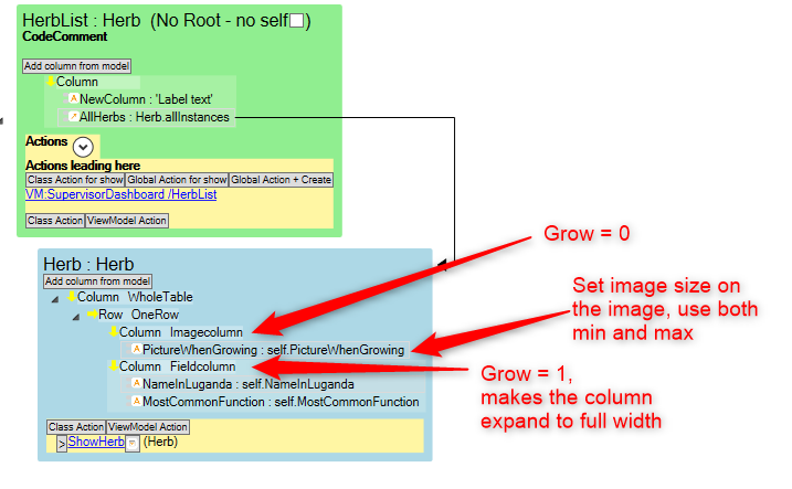
ViewModel:
The main thing to understand here is that you need to set:
- Imagecolumn to Grow = 0
- Fieldcolumn to Grow = 1
This makes the field column fill the remaining space horizontally.
You can control how large the columns will be on the column itself using Self-align (X-direction).


