BEM stands for Block, Element, Modifier and it is a convention on how to structure CSS rules. Read more here.
For Turnkey the natural Block in BEM is one placed ViewModel column/widget/control.
Out of the box (this is extended with UI overrides) you will see these Blocks:
BEM_BlockName.Add(CSSControlType.ctStaticText, "tk-static-text");
BEM_BlockName.Add(CSSControlType.ctImage, "tk-image");  //new
BEM_BlockName.Add(CSSControlType.ctTextEdit, "tk-text-field");
BEM_BlockName.Add(CSSControlType.ctCheckbox, "tk-checkbox");
BEM_BlockName.Add(CSSControlType.ctDatePicker, "tk-datepicker"); //new
BEM_BlockName.Add(CSSControlType.ctCombobox, "tk-select");
BEM_BlockName.Add(CSSControlType.ctGrid, "tk-data-table");
BEM_BlockName.Add(CSSControlType.ctGroupbox, "tk-groupbox"); //new
BEM_BlockName.Add(CSSControlType.ctButton, "tk-button");
BEM_BlockName.Add(CSSControlType.ctFile, "tk-file-upload");
BEM_BlockName.Add(CSSControlType.ctLink, "tk-link");
BEM_BlockName.Add(CSSControlType.ctTextArea, "tk-textarea"); //new  , multiline text
BEM_BlockName.Add(CSSControlType.ctNumberEdit, "tk-number-field"); //new
BEM_BlockName.Add(CSSControlType.ctFloatNumberEdit, "tk-float-field"); // new
A Block is the outer div that we place in the CSS-grid to position it at the same position you designed it.
The Element in BEM is then the inner parts of a BEM Block.
You will typically find these elements found inside blocks in Turnkey generated html:
BEM_ElementName.Add(CSSBEMElement.bEm__native, "__native");  // the actual html control
BEM_ElementName.Add(CSSBEMElement.bEm__interactive, "__interactive");  // the html control the user can change, similair to __native but for certain controls (checkbox) the __native is hidden and a span is __interactive
BEM_ElementName.Add(CSSBEMElement.bEm__label, "__label");  // the label
BEM_ElementName.Add(CSSBEMElement.bEm__content, "__content");  // enclosing inner div
Looking at html to exemplify we will get this html :
<div class="tk-component tk-text-field">
    <label class="tk-text-field__label">Name</label>
    <input class="tk-text-field__native">
</div>
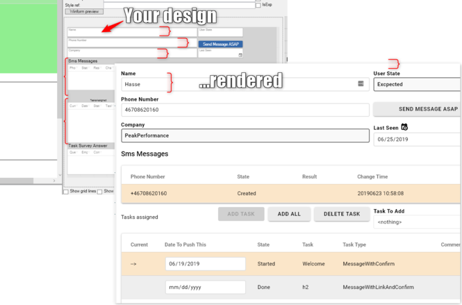
And it will be default rendered like this:
The aim of our BEM approach is to allow you to target a single element inside a specific block in order to override the style to your needs.
The third letter of BEM is Modifier. A Modifier is in the BEM convention typically described as an additional appendix to the element rules. In turnkey we treat all the style references that you add in the designer as Modifiers. These modifiers will be added as separate classes to block levels to make it easy for you to create modifier styles that match a block or element within a block by normal css rules.
Match all Turnkey-controls - disregarding type of control
To match all Turnkey-controls - regardless type of control - placed by the CSSGrid for the ViewModel you can use .tk-component. The tk-component cssclass is added to all BEM-Blocks.
If you want to style all <label> used by turnkey controls: .tk-component label{}
Possibly breaking changes introduced 2019-06-30
We aim to keep backwards compatibility - this time we needed to harmonize according to the BEM convention
| Was | Is | ||
|---|---|---|---|
| .tk-button | .tk-button_native | ||
| .tk-button.tk-button--narrow | .tk-button__native--narrow | ||
| .tk-checkbox__label | .tk-checkbox__content | the style did not target the label surrounding the __native | |
| .tk-checkbox | .tk-checkbox__interactive | ||
| .tk-data-table | .tk-data-table__content | the style targets the div containing the table | |
| .tk-data-table__content | .tk-data-table__native | this is the true table | |
| .tk-select__native-control | .tk-select__native | native-control should be native as everywhere else | |
| .tk-text-field | .tk-text-field__native | ||

