No edit summary |
No edit summary Tag: 2017 source edit |
||
| (68 intermediate revisions by 6 users not shown) | |||
| Line 1: | Line 1: | ||
<message>Write the content here to display this box</message> | |||
=== Theming with Variables and Vibe Coding === | |||
The Live-View offers model access to all css variables to make theming easy. | |||
Styling is used for many things - read the breakdown here [[Documentation:TwoTypesOfStyling|Documentation:TwoTypesOfStyling - MDrivenWiki]] | |||
An overview video is found here https://youtu.be/PyfcAlLFSw4?si=CbtIPRXjveq3fN0X | |||
<html> | |||
<iframe width="560" height="315" src="https://www.youtube.com/embed/PyfcAlLFSw4?si=CbtIPRXjveq3fN0X" title="YouTube video player" frameborder="0" allow="accelerometer; autoplay; clipboard-write; encrypted-media; gyroscope; picture-in-picture; web-share" referrerpolicy="strict-origin-when-cross-origin" allowfullscreen></iframe> | |||
</html> | |||
=== | === Older still valid - but superseded techniques === | ||
MDriven Turnkey's theming process allows you to create your own theme for the Turnkey application. You can change your brand's primary colors, font sizes, contextual colors, navbar colors, etc. | |||
MDriven Turnkey application uses SCSS to greatly simplify the source code for styling an application since it introduces variables and other logic that are missing from standard CSS. This was the reason for our decision to shift to the SCSS format on the source code for styling a Turnkey web app based on [https://material.io/design/ Material Design guidelines]. | |||
[https://sass-lang.com/ SCSS] (Sass) is a text format that compiles into CSS. | |||
[ | |||
==== How does this differ from "tkusercss"? ==== | |||
As we have described before, you may add your own styles to "[[Documentation:Tkusercss|Content/tkusercss.css]]". This article describes how to create a theme in a consistent SCSS-supported way that builds the very fabric of every aspect of the Turnkey app. | |||
You can | ==== Where to start? ==== | ||
[[File:2019-06-16 10h16 53.png|none|thumb| | Use the prototype run - LocalTurnkeyPrototyper option to get your application running locally. You can choose any free port. | ||
[[File:LocalTurnkeyPrototyper.jpg|none|thumb|795x795px]] | |||
[[File:Started Local Turnkey Prototyper.jpg|none|thumb|853x853px]] | |||
By doing this, you have access to the original SCSS files that control all the styling of the Turnkey web app. They are located in "'''application-root/Content/scss'''". | |||
[[File:SCSS in Turnkey Local Core.png|none|thumb|738x738px]] | |||
Use the Visual Studio Code editor to get context-sensitive help in updating the SCSS files to your liking. | |||
[[File:2019-06-16 10h16 53.png|none|thumb|850x850px]] | |||
Install the liveSassCompile plugin that can track your changes and turn the updated theme source code (SCSS) into CSS that the webserver uses. | |||
[[File:2019-06-16 10h33 40.png|none|thumb|852x852px]] | |||
By refreshing your local prototyping app, you'll get instant feedback on what the theme style change looks like. [[File:VS Code and Turnkey Core.jpg|none|thumb|857x857px]] | |||
When you save a changed SCSS as it is being watched by the sass compiler, it will compile into a new CSS theme file "theme-user.css". This new CSS is found here "'''application-root/Content/scss/theme-user.css'''". | |||
[[File:Compiled theme file.png|none|thumb|476x476px]] | |||
The Turnkey application will recognize that there now is an ''"'''''application-root/Content/scss/theme-user.css'''''"'' and will use that instead of the default ''"'''''application-root/Content/theme-default.css'''''"''. | |||
When you refresh your page, you will see that your modified theme is applied: | |||
[[File:Changed theme settings.png|alt=x|none|thumb|854x854px]] | |||
There are many possible changes you may want to experiment with: | |||
* Primary color | |||
* Contextual colors (danger, warning, success, and info) | |||
* Navigation bar color | |||
* Button's colors | |||
* Action's color | |||
* Font-size | |||
* Sizes of buttons and input components | |||
You may want to copy the updated SCSS repository and keep it safe. It will be overwritten with default styles the next time you get the latest version of the Turnkey core. The edited SCSS is your source code for your styles; even if the CSS is enough, it will be easier for you to make changes in the SCSS files. There is no way to go back from a CSS you have to the original SCSS that created it. | |||
[[File:2019-06-16 10h51 36.png|none|thumb|380x380px]] | |||
==== Deploying the New Resulting CSS to the Server ==== | |||
Now that we have managed to change the local site, we want to apply the same changes to a server-side site in Azure. This is done by simply copying the resulting "'''Content/scss/theme-user.css'''" to your [[Documentation:Theme and style|AssetsTK folder]] for the model. Add the same folder levels so that you get "'''xxxx_AssetsTK/Content/scss/theme-user.css'''" or "'''xxxx_AssetsTK/Content/theme-user.css'''". | |||
[[File:Deploy to the server.jpg|alt=|none|thumb|856x856px]] | |||
Upload your model to the server. | |||
[[File:Check file upload.jpg|none|thumb|725x725px]] | |||
==== How do I get the standard back? ==== | |||
To get the standard back, you only need to delete the "'''application-root/Content/scss/theme-user.css'''" or "'''application-root/Content/theme-user.css'''" from the server. To [[Documentation:Theme and style|delete files uploaded with AssetsTK refer to here]]. | |||
==== Do you want the web page to reload automatically while changing styles? ==== | |||
Read here on how to make your [[Documentation:Turnkey reload automatically on script change or style change|turnkey reload automatically on script change or style change]]. | |||
=== CSS Custom Properties === | |||
In the Turnkey application, you're able to change the styles of your application without compiling the source SASS code. We added the support of CSS Custom Properties to let you change the appearance of your application in a fast and easy way. | |||
Upload your model and | Use the '''[[Documentation:Tkusercss|tkusercss]]''' file to tweak the styling of your Turnkey app with the power of CSS Custom Properties (also known as CSS variables). | ||
* Create a "tkusercss.css" file according to '''[[Documentation:Tkusercss|this article]]''' in your model directory and place it in the "Content" folder. | |||
* Add your color values and other settings into the "tkusercss" file. | |||
* Upload your model with MDriven Designer and get all the changes online in your application instantly. | |||
==== Structure of "tkusercss.css" ==== | |||
When you have created tkusercss.css, open it with your preferred text or code editor and add the following declaration. | |||
:root { } | |||
The <code>'''<span class="col-black">:root</span>'''</code> selector in CSS matches the document's root element and is a place where you put your own values for custom properties (CSS variables). | |||
The syntax of the CSS custom properties declaration: | |||
--name-of-custom-property: value; | |||
==== List of the Changeable Properties in the Turnkey Application ==== | |||
* --base-font-size ''(Pixels)'' | |||
* --base-bg-color ''(RGB format)'' | |||
* --base-border-radius ''(Pixels)'' | |||
* --navbar-height ''(Pixels)'' | |||
* --navbar-bg-color ''(RGB format)'' | |||
* --navbar-brand-color ''(RGB format)'' | |||
* --navbar-link-color ''(RGB format)'' | |||
* --sidebar-bg-color ''(RGB format)'' | |||
* --primary-color ''(RGB format)'' | |||
* --primary-color-dark ''(RGB format)'' | |||
* --text-on-primary ''(RGB format)'' | |||
* --danger-color ''(RGB format)'' | |||
* --danger-color-dark ''(RGB format)'' | |||
* --text-on-danger ''(RGB format)'' | |||
* --warning-color ''(RGB format)'' | |||
* --warning-color-dark ''(RGB format)'' | |||
* --text-on-warning ''(RGB format)'' | |||
* --success-color ''(RGB format)'' | |||
* --success-color-dark ''(RGB format)'' | |||
* --text-on-success ''(RGB format)'' | |||
* --save-action-bg-color ''(RGB format)'' | |||
* --save-action-bg-color-dark ''(RGB format)'' | |||
* --save-action-text-color ''(RGB format)'' | |||
* --cancel-action-bg-color ''(RGB format)'' | |||
* --cancel-action-bg-color-dark ''(RGB format)'' | |||
* --cancel-action-text-color ''(RGB format)'' | |||
* --redo-action-bg-color ''(RGB format)'' | |||
* --redo-action-bg-color-dark ''(RGB format)'' | |||
* --redo-action-text-color ''(RGB format)'' | |||
* --undo-action-bg-color ''(RGB format)'' | |||
* --undo-action-bg-color-dark ''(RGB format)'' | |||
* --undo-action-text-color ''(RGB format)'' | |||
* --data-table-header-bg-color (RGB format) | |||
* --data-table-header-text-color (RGB format) | |||
* --data-table-header-height (Pixels) | |||
* --data-table-body-bg-color (RGB format) | |||
* --data-table-body-text-color (RGB format) | |||
* --data-table-row-height (Pixels) | |||
'''Notice!''' All color properties should be inserted in the RGB format. For example: '''--primary-color: 245, 156, 26;''' | |||
=== Turnkey Themes === | |||
We made you a couple of precompiled themes for your MDriven Turnkey application. To apply the following themes, download the zip archive below and extract it. You will receive a "theme-user.css" file which you should put into the "Content" folder in the [[Documentation:AssetsTK|AssetsTK]], then upload your model with [https://mdriven.net/designer MDriven Designer]. | |||
Also, see the new functionality: [[Documentation:Theme as data|Theme as data]]. | |||
==== MDriven Dark Theme ==== | |||
[[File:Mdriven dark theme.png|none|thumb|649x649px]] | |||
[[File:Mdriven-dark-theme-preview-2.png|none|thumb|651x651px]]'''Download:''' [[File:MDriven Dark theme.zip|none|thumb|MDriven dark theme]] | |||
==== Vivid Blue Theme ==== | |||
[[File:Vivid blue theme preview.png|thumb|651x651px|none]] | |||
[[File:Vivid blue theme preview 2.png|thumb|651x651px|none]]'''Download:'''[[File:Vivid blue theme.zip|alt=Vivid blue theme for MDriven Turnkey|thumb|Vivid blue theme|none]] | |||
==== Lime Green Theme ==== | |||
[[File:Lime green theme preview.png|none|thumb|653x653px]] | |||
[[File:Lime green theme preview 2.png|none|thumb|655x655px]]'''Download:'''[[File:Lime green theme.zip|alt=Lime green theme|none|thumb|Lime green theme]] | |||
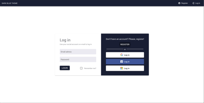
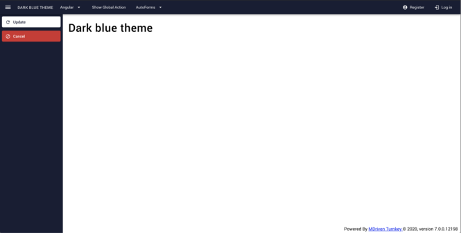
==== Dark Blue Theme ==== | |||
[[File:Dark blue theme preview.png|alt=Dark blue theme preview|none|thumb|663x663px]] | |||
[[File:Dark blue theme preview 2.png|alt=Dark blue theme preview 2|none|thumb|665x665px]]'''Download:'''[[File:Dark blue theme.zip|none|thumb]] | |||
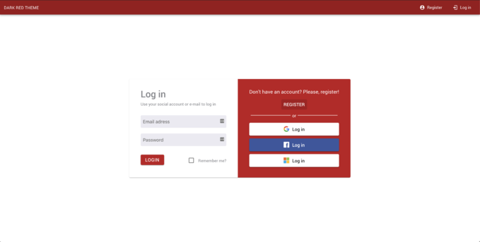
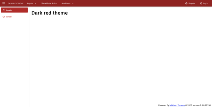
==== Dark Red Theme ==== | |||
[[File:Dark red- heme preview 1.png|none|thumb|679x679px]] | |||
[[File:Dark-red-theme-preview-2.png|none|thumb|678x678px]] | |||
'''Download:''' | |||
[[File:Dark red theme.zip|none|thumb|Dark red theme]] | |||
==== Compact Theme ==== | |||
The compact theme for MDriven Turnkey will make your components smaller and allow you to fit more information on the app's pages. | |||
'''Download:''' | |||
[[File:Compact theme.zip|none|thumb|Compact theme]] | |||
[[Category:MDriven Turnkey]] | |||
{{Edited|July|12|2025}} | |||
[[Category:TOC]] | |||
Latest revision as of 13:01, 26 May 2025
Theming with Variables and Vibe Coding
The Live-View offers model access to all css variables to make theming easy.
Styling is used for many things - read the breakdown here Documentation:TwoTypesOfStyling - MDrivenWiki
An overview video is found here https://youtu.be/PyfcAlLFSw4?si=CbtIPRXjveq3fN0X
Older still valid - but superseded techniques
MDriven Turnkey's theming process allows you to create your own theme for the Turnkey application. You can change your brand's primary colors, font sizes, contextual colors, navbar colors, etc.
MDriven Turnkey application uses SCSS to greatly simplify the source code for styling an application since it introduces variables and other logic that are missing from standard CSS. This was the reason for our decision to shift to the SCSS format on the source code for styling a Turnkey web app based on Material Design guidelines.
SCSS (Sass) is a text format that compiles into CSS.
How does this differ from "tkusercss"?
As we have described before, you may add your own styles to "Content/tkusercss.css". This article describes how to create a theme in a consistent SCSS-supported way that builds the very fabric of every aspect of the Turnkey app.
Where to start?
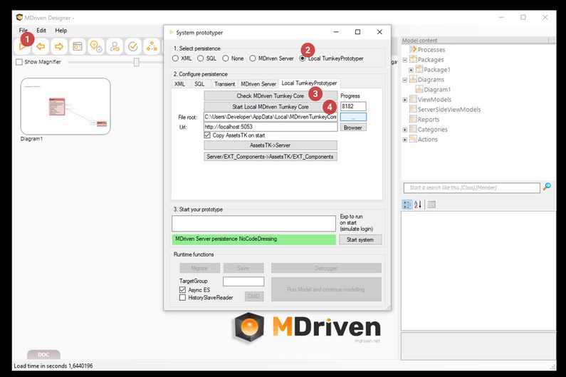
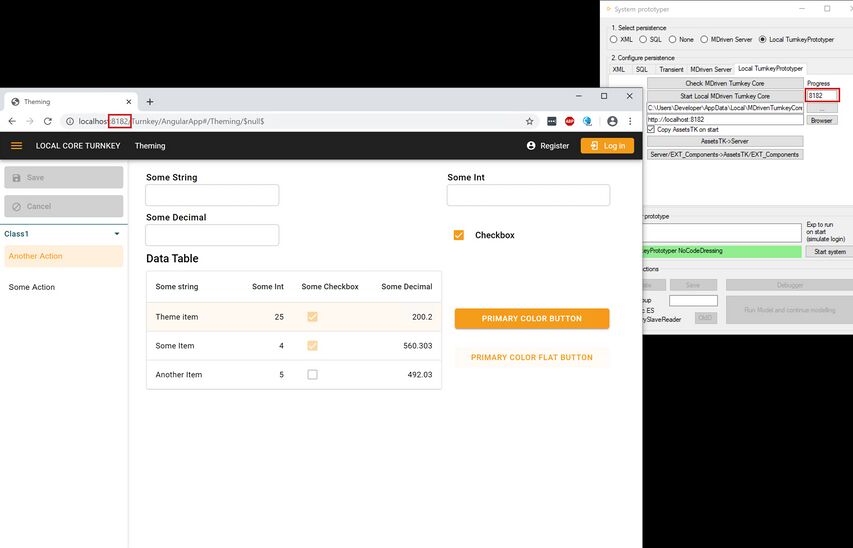
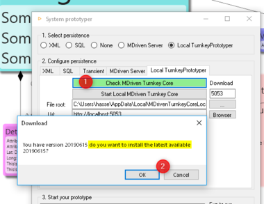
Use the prototype run - LocalTurnkeyPrototyper option to get your application running locally. You can choose any free port.
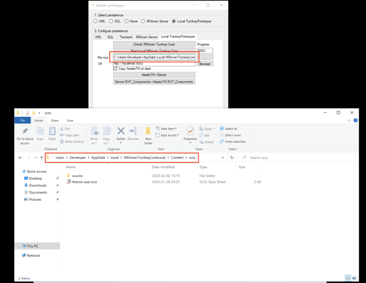
By doing this, you have access to the original SCSS files that control all the styling of the Turnkey web app. They are located in "application-root/Content/scss".
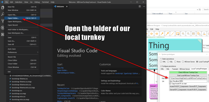
Use the Visual Studio Code editor to get context-sensitive help in updating the SCSS files to your liking.
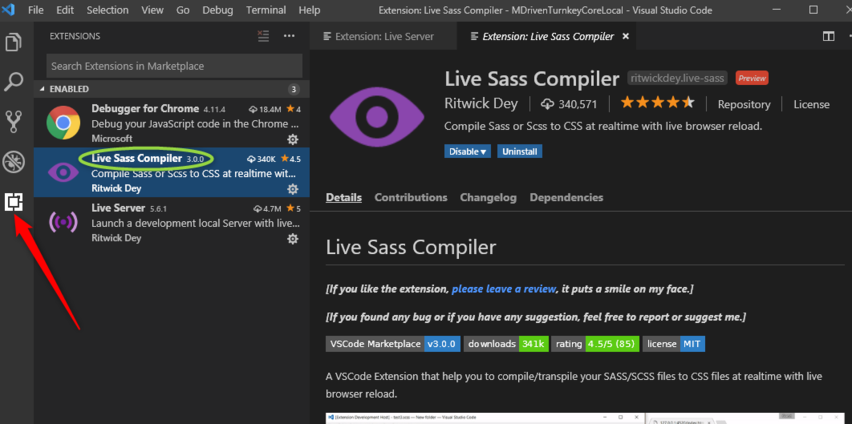
Install the liveSassCompile plugin that can track your changes and turn the updated theme source code (SCSS) into CSS that the webserver uses.
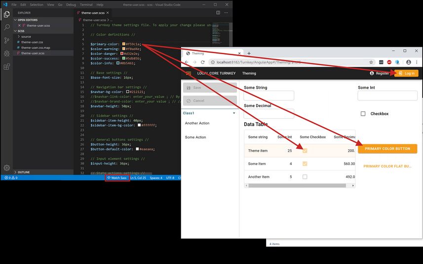
By refreshing your local prototyping app, you'll get instant feedback on what the theme style change looks like.
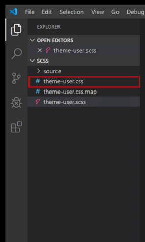
When you save a changed SCSS as it is being watched by the sass compiler, it will compile into a new CSS theme file "theme-user.css". This new CSS is found here "application-root/Content/scss/theme-user.css".
The Turnkey application will recognize that there now is an "application-root/Content/scss/theme-user.css" and will use that instead of the default "application-root/Content/theme-default.css".
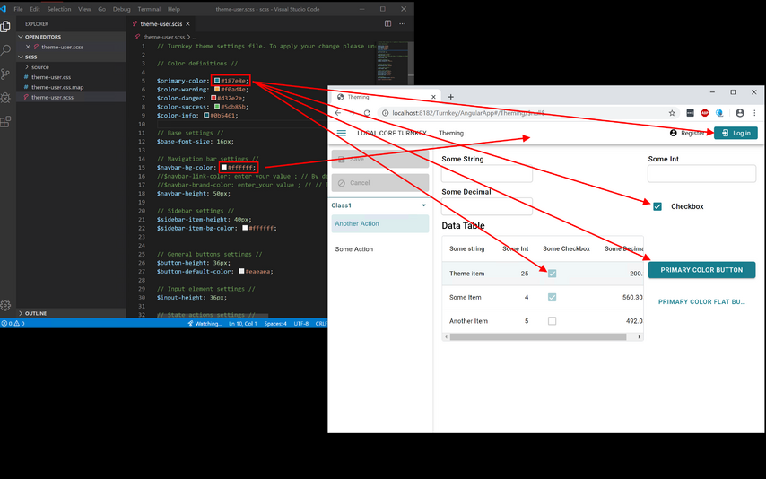
When you refresh your page, you will see that your modified theme is applied:
There are many possible changes you may want to experiment with:
- Primary color
- Contextual colors (danger, warning, success, and info)
- Navigation bar color
- Button's colors
- Action's color
- Font-size
- Sizes of buttons and input components
You may want to copy the updated SCSS repository and keep it safe. It will be overwritten with default styles the next time you get the latest version of the Turnkey core. The edited SCSS is your source code for your styles; even if the CSS is enough, it will be easier for you to make changes in the SCSS files. There is no way to go back from a CSS you have to the original SCSS that created it.
Deploying the New Resulting CSS to the Server
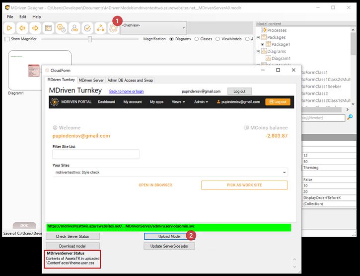
Now that we have managed to change the local site, we want to apply the same changes to a server-side site in Azure. This is done by simply copying the resulting "Content/scss/theme-user.css" to your AssetsTK folder for the model. Add the same folder levels so that you get "xxxx_AssetsTK/Content/scss/theme-user.css" or "xxxx_AssetsTK/Content/theme-user.css".
Upload your model to the server.
How do I get the standard back?
To get the standard back, you only need to delete the "application-root/Content/scss/theme-user.css" or "application-root/Content/theme-user.css" from the server. To delete files uploaded with AssetsTK refer to here.
Do you want the web page to reload automatically while changing styles?
Read here on how to make your turnkey reload automatically on script change or style change.
CSS Custom Properties
In the Turnkey application, you're able to change the styles of your application without compiling the source SASS code. We added the support of CSS Custom Properties to let you change the appearance of your application in a fast and easy way.
Use the tkusercss file to tweak the styling of your Turnkey app with the power of CSS Custom Properties (also known as CSS variables).
- Create a "tkusercss.css" file according to this article in your model directory and place it in the "Content" folder.
- Add your color values and other settings into the "tkusercss" file.
- Upload your model with MDriven Designer and get all the changes online in your application instantly.
Structure of "tkusercss.css"
When you have created tkusercss.css, open it with your preferred text or code editor and add the following declaration.
:root { }
The :root selector in CSS matches the document's root element and is a place where you put your own values for custom properties (CSS variables).
The syntax of the CSS custom properties declaration:
--name-of-custom-property: value;
List of the Changeable Properties in the Turnkey Application
- --base-font-size (Pixels)
- --base-bg-color (RGB format)
- --base-border-radius (Pixels)
- --navbar-height (Pixels)
- --navbar-bg-color (RGB format)
- --navbar-brand-color (RGB format)
- --navbar-link-color (RGB format)
- --sidebar-bg-color (RGB format)
- --primary-color (RGB format)
- --primary-color-dark (RGB format)
- --text-on-primary (RGB format)
- --danger-color (RGB format)
- --danger-color-dark (RGB format)
- --text-on-danger (RGB format)
- --warning-color (RGB format)
- --warning-color-dark (RGB format)
- --text-on-warning (RGB format)
- --success-color (RGB format)
- --success-color-dark (RGB format)
- --text-on-success (RGB format)
- --save-action-bg-color (RGB format)
- --save-action-bg-color-dark (RGB format)
- --save-action-text-color (RGB format)
- --cancel-action-bg-color (RGB format)
- --cancel-action-bg-color-dark (RGB format)
- --cancel-action-text-color (RGB format)
- --redo-action-bg-color (RGB format)
- --redo-action-bg-color-dark (RGB format)
- --redo-action-text-color (RGB format)
- --undo-action-bg-color (RGB format)
- --undo-action-bg-color-dark (RGB format)
- --undo-action-text-color (RGB format)
- --data-table-header-bg-color (RGB format)
- --data-table-header-text-color (RGB format)
- --data-table-header-height (Pixels)
- --data-table-body-bg-color (RGB format)
- --data-table-body-text-color (RGB format)
- --data-table-row-height (Pixels)
Notice! All color properties should be inserted in the RGB format. For example: --primary-color: 245, 156, 26;
Turnkey Themes
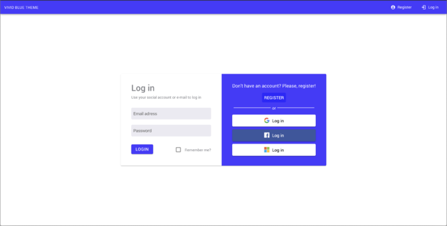
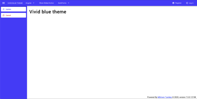
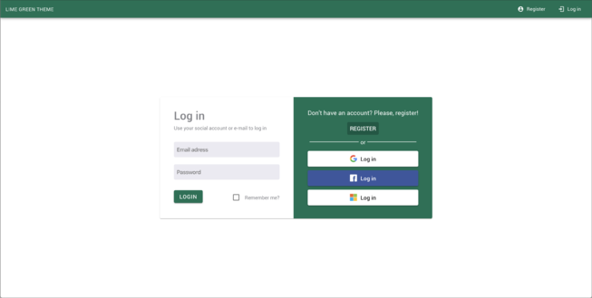
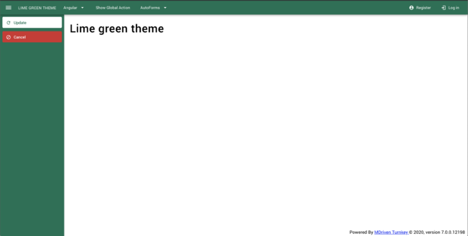
We made you a couple of precompiled themes for your MDriven Turnkey application. To apply the following themes, download the zip archive below and extract it. You will receive a "theme-user.css" file which you should put into the "Content" folder in the AssetsTK, then upload your model with MDriven Designer.
Also, see the new functionality: Theme as data.
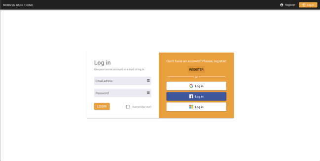
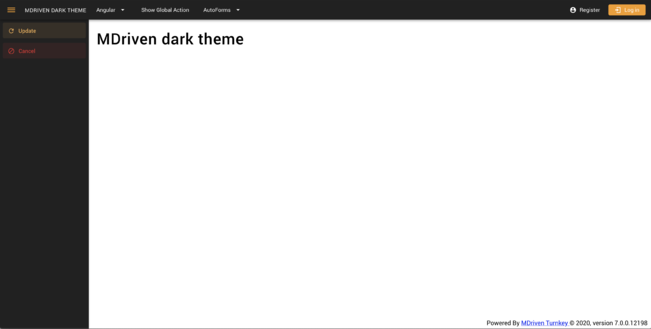
MDriven Dark Theme
Download: File:MDriven Dark theme.zip
Vivid Blue Theme
Download:File:Vivid blue theme.zip
Lime Green Theme
Download:File:Lime green theme.zip
Dark Blue Theme
Download:File:Dark blue theme.zip
Dark Red Theme
Download: File:Dark red theme.zip
Compact Theme
The compact theme for MDriven Turnkey will make your components smaller and allow you to fit more information on the app's pages.
Download: File:Compact theme.zip

