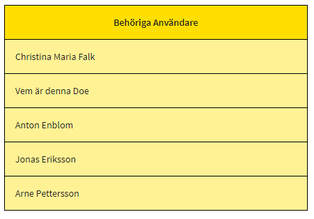
A simple table component for just listing a collection
No edit summary |
m ((username removed) (log details removed)) |
||
| (13 intermediate revisions by 3 users not shown) | |||
| Line 1: | Line 1: | ||
This is an example of | This is an example of how to use [[EXT Components]] to override the default grid/table when you want to show the contents and don't need any action/selections. | ||
need any | |||
This is a generic component named | This is a generic component named '''plaintable''' that can be used for any ViewModel column with a collection value. The presentation of the column will be the title of the table (in the header row) and the rows will show the default string representation of the items in the collection. | ||
of the column will be the title of the table (in the header row) and the rows will show the default string representation of the | |||
items in the collection. | The result will look like this: | ||
[[File:Plaintable.PNG]] | |||
The files below are saved in a plaintable folder like this: | |||
[[File:Plaintablekatalog.PNG]] | |||
== plaintable.chtml == | == plaintable.chtml == | ||
<pre> | <pre> | ||
<table class="plaintable"> | <table class="plaintable"> | ||
<thead> | <thead> | ||
<tr> | |||
<th class="plaintable">[ViewModelColumnLabel]</th> | |||
</tr> | |||
</thead> | </thead> | ||
<tr ng-repeat="row in data.[ViewModelColumnName]"> | <tr ng-repeat="row in data.[ViewModelColumnName]"> | ||
<td class="plaintable">{{row.asString}}</td> | |||
</tr> | |||
</tr> | |||
</table> | </table> | ||
</pre> | </pre> | ||
| Line 51: | Line 55: | ||
} | } | ||
</pre> | </pre> | ||
[[Category:Advanced]] | |||
[[Category:Components]] | |||
Latest revision as of 05:48, 11 January 2024
This is an example of how to use EXT Components to override the default grid/table when you want to show the contents and don't need any action/selections.
This is a generic component named plaintable that can be used for any ViewModel column with a collection value. The presentation of the column will be the title of the table (in the header row) and the rows will show the default string representation of the items in the collection.
The result will look like this:
The files below are saved in a plaintable folder like this:
plaintable.chtml
<table class="plaintable">
 <thead>
  <tr>
   <th class="plaintable">[ViewModelColumnLabel]</th>
  </tr>
 </thead>
 <tr ng-repeat="row in data.[ViewModelColumnName]">
  <td class="plaintable">{{row.asString}}</td>
 </tr>
</table>
plaintable.css
table.plaintable {
  border-collapse: collapse;
  border: 1px solid black;
}

td.plaintable {
  border: 1px solid black;
  padding: 2px 5px 2px 5px;
  background-color: rgb(255,242,149);
  padding: 15px;
  text-align: left;
  font-family: "Source Sans Pro", sans-serif;
  font-size: 1rem;
  font-weight: 400;
}

th.plaintable {
  border: 1px solid black;
  padding: 10px 10px 10px 10px;
  background-color: rgb(254,223,0);
  padding: 15px;
  font-family: "Source Sans Pro", sans-serif;
  font-size: 14px;
  font-weight: 700;
  text-align: center;
}
This page was edited 127 days ago on 01/11/2024. What links here


