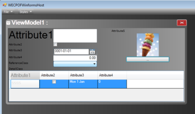
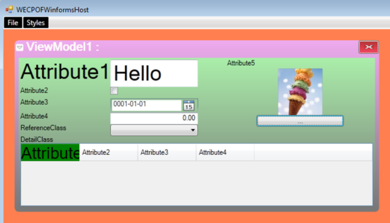
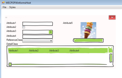
This post is about how to get the cool things of WPF to merge with the cool things of ECO.
- We need to get the XAML styles into our declarative application.
- We need to declare and use style names on specific places in our UI where it makes sense to us.
- We need to inject FormatStrings into our declarative DataBindings.
- We need all of this at a granular level so that we will not be limited by the tool. For example, we need to be able to control a single column in a grid separately as well as its header differently from its cells.
All of this is done with XAML ResourceDictionaries. Make your own with Blend or Notepad or any other tool you like.
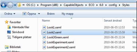
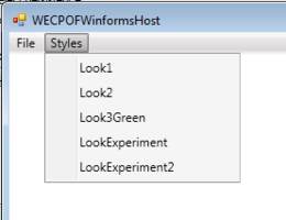
If you add your dictionaries to the Config folder of ECO, we will pick them up in the style Menu:
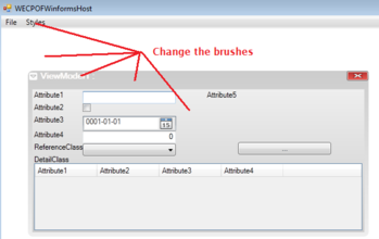
When you click a Style in WECPOF-runtime, we load that Dictionary and merge it with the Application.
What Can You Change?
Code Snippet

<!– WECPOFWinBackgroundBrush The background of a single window –>
<LinearGradientBrush x:Key="WECPOFWinBackgroundBrush" EndPoint="0,1"StartPoint="0,0">
     <GradientStop Color="#eae" Offset="0.0" />
     <GradientStop Color="#777" Offset="1.0" />
</LinearGradientBrush>


<!– WECPOFWinContentBackgroundBrush The background of content plate of a single window –>
<LinearGradientBrush x:Key="WECPOFWinContentBackgroundBrush" EndPoint="0,1"StartPoint="0,0">
     <GradientStop Color="#aea" Offset="0.0" />
     <GradientStop Color="#777" Offset="1.0" />
</LinearGradientBrush>


<!– WECPOFWindowEnvironmentBackgroundBrush The background of the containing window , the master window –>
<SolidColorBrush x:Key="WECPOFWindowEnvironmentBackgroundBrush"  Color="Coral">
</SolidColorBrush>

<!–   WECPOFWinFrameBrush  –>
   WECPOFWINHeaderStyle  The style used for the window header–>
<Style x:Key="WECPOFWINHeaderStyle" TargetType="{x:Type TextBlock}">
   <Setter Property="Foreground" Value="Snow"></Setter>
   <Setter Property="Margin" Value="2,0,2,0"></Setter>
   <Setter Property="FontSize" Value="20"/>
   <Setter Property="FontWeight" Value="ExtraBold"></Setter>
</Style>


<!–  WECPOFMenuStyle  The style used for Main Menu–>
<Style x:Key="WECPOFMenuStyle" TargetType="{x:Type Menu}">
     <Setter Property="Background" Value="{StaticResource MenuBackground}"/>
…CUT FOR CLARITY
     </Setter>
</Style>


<!–  WECPOFMenuItemStyle  The style used for MenuItems–>
<Style x:Key="WECPOFMenuItemStyle" TargetType="{x:Type MenuItem}">
     <Setter Property="Background" Value="Black"></Setter>
     <Setter Property="Foreground" Value="White"></Setter>
</Style>
What More Can You Do?
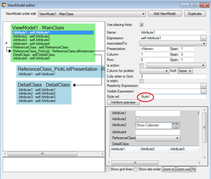
When you set the StyleRef on ViewModelColumns, you can define a corresponding Style in XAML.
Since the ViewModelColumn often spawns two controls, the TextBlock and in this case, a TextBox, we have defined the naming convention of STYLENAME.COMPONENTTYPE.
This enables you to define Style1 for all control types you use:
Code Snippet
<!– Style for the TextBlock part of a ViewModelCOlumn that has Style1 in the StyleRef–>
<Style x:Key="Style1.TextBlock" >
  <Setter Property="TextBlock.FontSize" Value="36"/>
</Style>

<!– Style for the TextBox part of a ViewModelCOlumn that has Style1 in the StyleRef–>
<Style x:Key="Style1.TextBox"  TargetType="{x:Type TextBox}">
    <Setter Property="FontSize" Value="36"/>
</Style>
There is More
In WPF, you can set a StringFormat on a Binding to aid in common transformations like “show only 2 decimals”, “present the DateTime in text format”, “This value is really percent” etc.
This need is also addressed with a naming convention in the XAML resource dictionary:
Code Snippet
<!– Format string can be defined per Style and is used in the Binding – use this to format dates and doubles etc –>
<sys:String x:Key="StyleNumber2Dec.StringFormat">{0:n}</sys:String>
<sys:String x:Key="FormatDate.StringFormat">ddd d MMM</sys:String>
Use a StyleRef in the ViewModelColumn and create a string entry in the resource dictionary with a key of STYLENAME.StringFormat. We apply this when setting up the Binding for the components in your view.
And We Need Grid Precision Too
A DataGrid has Styles that not only apply to the whole Grid but also to individual styles per GridColumn:
Code Snippet

<!– DataGrid column offers two styles, HeaderStyle and CellStyle –>
<!– This is how you define the HeaderStyle–>
<Style x:Key="StyleOnColumn.HeaderStyle.DataGridTextColumn" TargetType="{x:Type prim:DataGridColumnHeader}">
     <Setter Property="Height" Value="30"/>
     <Setter Property="Background" Value="Green"/>
     <Setter Property="Foreground" Value="Black"/>
     <Setter Property="FontSize" Value="28" />
</Style>


<!– DataGrid column offers two styles, HeaderStyle and CellStyle –>
<!– This is how you define the CellStyle–>
<Style x:Key="StyleOnColumn.CellStyle.DataGridTextColumn" TargetType="{x:Type tk:DataGridCell}">
     <Setter Property="Height" Value="30"/>
     <Setter Property="Background" Value="Yellow"/>
     <Setter Property="Foreground" Value="Black"/>
     <Setter Property="FontSize" Value="18" />
</Style>

<!– To tell a grid to use a default style on all ColumnHeaders–>
<Style x:Key="StyleOnColumn.ColumnHeaderStyle.DataGrid" TargetType="{x:Type tkPrimitives:DataGridColumnHeader}">
      <Setter Property="Height" Value="20"/>
      <Setter Property="Background" Value="Yellow"/>
      <Setter Property="Foreground" Value="Green"/>
      <Setter Property="FontSize" Value="16" />
</Style>


<!– To tell a grid to use a RowStyle –>
<Style x:Key="StyleOnColumn.RowStyle.DataGrid" TargetType="{x:Type tk:DataGridRow}">
    <Setter Property="Height" Value="20"/>
    <Setter Property="Foreground" Value="Green"/>
    <Setter Property="FontSize" Value="16" />
</Style>


<!– To tell a grid to use a Default CellStyle –>
<Style x:Key="StyleOnColumn.CellStyle.DataGrid" TargetType="{x:Type tk:DataGridCell}">
    <Setter Property="Height" Value="20"/>
    <Setter Property="Background" Value="Transparent"/>
    <Setter Property="Foreground" Value="Blue"/>
    <Setter Property="FontSize" Value="12" />
</Style>
The Result
The result is that you can be very flexible in how you want to convey information:
Help Us Out, Please!
Create your own styles and send them to us. We will use your name on the style so that you become a famous XAML designer before you know it!
Updates 2018
To get generic styles to match all un-styled DateTimes, for example, you can now add this string format:
<sys:String x:Key="DateTime.StringFormat">yyyy-MM-dd HH:mm</sys:String>
This can be used for all simple types: double, float, bool, etc - but not for string since that would not be helpful.

